Ready for Life: Scouting's new brand welcomes in a new era

Around the world and over the years, Scouting has evolved and adapted with the times - reimagining and refreshing our image to remain as relevant today as we were more than a century ago. Today, World Scouting is taking another step forward in that journey with a newly refreshed brand that will help us usher in the next decade for Scouting.
Inspired by the ideas and energy of a global community of more than 57 million Scouts and volunteers, we are ready to adopt a new Vision and Strategy for Scouting to be the world’s most inspiring and inclusive youth movement creating transformative learning experiences for every young person, everywhere.
Our refreshed brand aims to inspire Scouts and National Scout Organizations to join us on this adventure as we continue to lead the way as an inclusive, sustainable and impactful global movement - creating opportunities for young people to discover their identity, learn new skills, serve their communities, and be ready for life.
Over the past year, we have worked to review and refresh the image of Scouting to position us for the future alongside partners and collaborators. The result is an exciting new visual identity and story for Scouting rooted in our global mission to shape the lives of young people worldwide.
The new look for Scouting includes a modern redesign of the iconic World Scout Emblem, a reimagined logo and wordmark for World Scouting, a new tagline “Ready for Life” available in multiple languages, an expanded and more vibrant colour palette, a unique and modern typeface, and a range of secondary creative visual elements to be used across all our digital, communications and marketing channels.
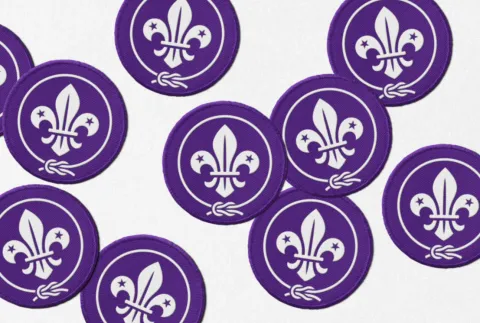
The iconic World Scout Emblem
Each element of our refreshed brand is unique and has a specific role to play. The World Scout Emblem dates back to the first Scouting expedition on Brownsea Island. Over the years the emblem has been refined and updated, but the meaning has never changed as a universal symbol for Scouts.
The fleur-de-lys is our compass and embodies our values, the stars stand for truth and knowledge, the bond is what brings us all together, and the circular rope in a central reef knot symbolises the unity of our global movement. The newly redesigned World Scout Emblem has been carefully crafted to remain true to the elements enshrined in our Constitution and to honour Scouting’s heritage while evolving to introduce a more modern and practical design.
The redesigned World Scout Emblem will continue to be a symbol of belonging to the Scout Movement, worn as a badge by Scouts worldwide, and will ensure that this iconic mark remains relevant for future generations as our brand continues to grow and evolve in a digital world. The emblem is used on millions of uniforms worldwide, for official, constitutional, and institutional purposes, as well as for hero moments and universal Scouting experiences that bring us together. The World Scout Badge and World Scout Flag consist solely of the World Scout Emblem, and the emblem can also be used in other applications that include World Scout event logos, key educational initiatives, official certificates and awards, as well as a supporting ‘watermark’ of authenticity.

A new look for World Scouting
The World Scouting logo establishes a unique brand and identity for the organisation distinct from the World Scout Emblem as a symbol for the Scout Movement. The World Scouting logomark retains some of the key elements of the emblem with a modern and simplified look that makes it unique to the brand of World Scouting.
The name World Scouting acts as a shorthand for the World Organization of the Scout Movement and is intended to be easily identifiable by National Scout Organizations while positioning us clearly alongside partners, funders and other collaborators we work with.
The World Scouting logo leads the way across our communications, marketing, and digital applications, especially at smaller sizes and brings a modern touch to our brand's identity. There are two language versions of the logo in English and French, the two official languages of World Scouting. The World Scouting logo can be used by National Scout Organizations to signify and visualise their recognised status as Member Organizations of a global Movement.
In specific applications, the logomark can be used in place of the World Scouting logo, and is designed to be as versatile and creative as possible to work across multiple mediums and formats, such as for social media avatars and favicons, or small-use applications and merchandising.

A tagline that’s about being “Ready for Life”
Our new tagline, "Ready for Life", encapsulates Scouting's mission to contribute to the education of young people, enabling them to be global citizens who are playing a constructive role in society. The tagline is simple and connects seamlessly to the Scout motto to "Be Prepared."
The tagline works well in English, as well as in French, Spanish, and Arabic as the official and working languages of World Scouting. It offers a creative brand element, separate from our logo, that can be used across a variety of digital, advertising, merchandise and campaign applications.
Creative and colourful design elements
The core World Scouting colours reflect the natural elements of our world - the oceans, forests, deserts and flora. “Scouting Purple” remains our hero colour, but is supported with a vibrant and flexible secondary colour palette that is rich and bright. Our colours can be used in combination, and adhere to international standards for web content accessibility and as a guide for other applications to ensure high contrast and legibility of text.
Our primary typeface, Scouts GT Planar, is full of quirky details and distinctive characters that reflect the unique personality of Scouting. The type can allow us to communicate with gravitas and impact when needed, but also allows us to be fun and playful by using the type in a more creative and interesting way. We also use Noto Sans, a global font collection for writing in over 800 languages, both modern and ancient, for everyday use and digital applications.

Our unique shapes and stitches
Supporting the creative concept for our refreshed brand is a series of secondary graphic and visual elements that help to tell our story, and connect to the essence of Scouting. The fabric of our graphic language is made up of two elements.
The first is our shapes which are inspired by the structure of the World Scout Emblem and the unique looks of Scout badges around the world. These shapes create a flexible and distinctive graphic language that is bold, colourful and can move while highlighting the aspects of discovery, curiosity and character-building experiences that are inherent to Scouting.
The second element is our stitches. Inspired by the woven elements of Scout badges, knots and scarves, the stitches bring a rich tapestry, patterning and unique detailing to our visual identity. These stitches provide a graphic element that binds the visual identity together and offers us a way to tell the story about the connections and friendships that Scouting creates.
Fun and impactful stories and images
World Scouting's tone of voice is welcoming, curious, playful, and impactful. We use simple and empathetic language that can make everyone feel like they belong as a member of this global Scouting family. At its heart Scouting is fun, and our tone of voice is celebrated through engaging, vivid language that sparks imagination and invites participation. Our tone balances fun with seriousness, mixing light-hearted phrasing and humour with informed and urgent messages that talk about big issues that can motivate Scouts to take action as active global citizens.
Our imagery consists of photography and video which both play an important role in telling our story and building a rich narrative across all forms of communication. Our photos and videos are rooted in the authentic experiences of Scouts and portray the everyday activities of Scouting across the globe. From images of Scouts responding to the climate crisis in their communities to reels of Scouts losing their sunglasses at the last Jamboree - our images are about sharing the unique experiences, people and places at the heart of our Scouting community.
An open and participatory process
Our refreshed brand has been the result of an open and participatory process with our Movement, led by a dedicated team of staff and volunteers. Together we partnered with Dragon Rouge, a world-class creative and marketing agency, to refresh World Scouting’s branding and messaging for the future in line with the priorities of our new Vision and Strategy for Scouting.
We started by listening to our global community and conducting in-depth research, focus groups and interviews about our brand with National Scout Organization leadership, young people, adult volunteers, World Scout Bureau and World Scout Foundation staff, World and Regional Scout Committee members, and key partners and stakeholders involved in Scouting. We gathered feedback about the elements of our brand to refresh at the Strategy for Scouting workshop in May 2023, engaged National Scout Organizations that currently use the world brand as their national brand identities, and shared regular progress updates with our governance structures and Member Organizations through in-person meetings, e-newsletters and online town halls to bring them along in the journey.
The refreshed brand and visual identity was approved by the World Scout Committee following their March 2024 meeting, and funding for this initiative was provided by a number of generous BP Fellows through the World Scout Foundation to support our new Strategy for Scouting and refreshed brand.

Unveiling our brand to the Scout Movement
Today we are unveiling the refreshed brand across World Scouting’s global and regional communications channels and web platforms through a creative campaign, including a redesign of the scout.org website, promotion of the refreshed brand across social media, upgrades to the organisation’s stationery package, and a new line of branded merchandise that will be available for sale for the first time at the 43rd World Scout Conference.
Online brand guidelines, together with key downloadable brand artwork files, have also been developed and integrated into a new digital solution that will act as a central repository for all World Scouting brand assets. The brand guidelines are now publicly available and accessible at brand.scout.org offering National Scout Organizations and other key stakeholders clear guidance about how to use the visual identity and tone of voice for the refreshed World Scouting brand consistently and effectively. This digital solution will soon become the new home for our photo and video media library featuring AI tools that will make searching and creating content easier than ever.
National Scout Organizations will get an opportunity to experience the refreshed brand in full effect during the 43rd World Scout Conference in Egypt, and we look forward to sharing more updates and guidance as we look to the future, and this exciting new chapter for our Movement.